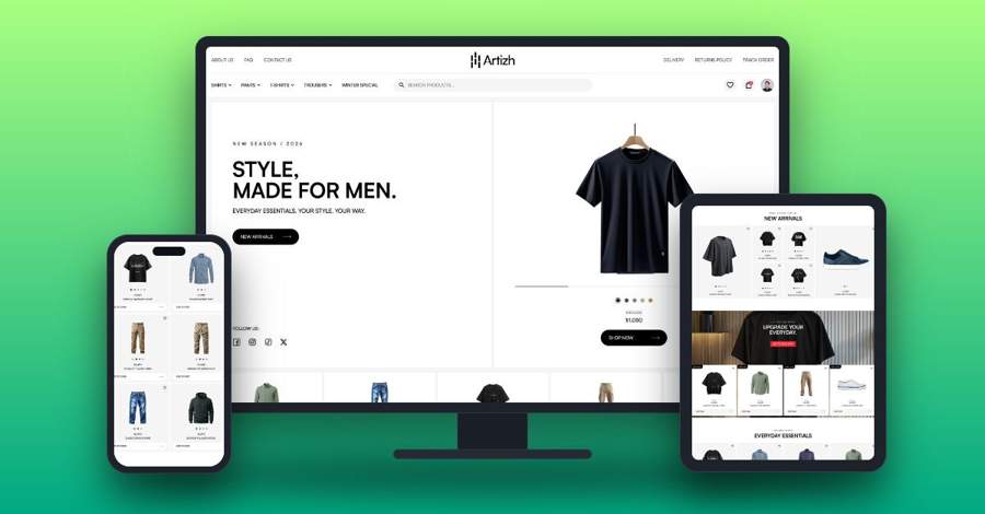
More than 60% of web traffic now comes from mobile devices. If your website doesn’t adapt to every screen, you’re losing customers before they even read your first line.
Responsive web design means your website automatically adjusts its layout, images and navigation to fit any device, from a large desktop monitor to a tablet or a smartphone. Here is what it actually does for your business.
1. Better user experience
Visitors can browse, read and buy comfortably on any device, with no pinching or zooming. When a website is easy to use, people trust it more and stay longer.
2. Higher Google rankings
Google uses mobile-first indexing, which means it looks at the mobile version of your website when deciding how to rank it. A mobile-friendly site directly supports your SEO.
3. More conversions
When checkout pages and contact forms work smoothly on phones, more visitors become customers. A frustrating mobile experience is one of the fastest ways to lose a sale or an enquiry.
4. Lower bounce rates
People stay longer on websites that load properly and are easy to navigate. A responsive layout keeps visitors exploring instead of hitting the back button.
5. Faster load times
Well-built responsive websites are optimized for performance, with properly sized images and clean code. Every second counts, especially on mobile networks.
6. One website, lower cost
You maintain one website instead of separate desktop and mobile versions. That means one design, one build and one set of content to manage.
7. Easier maintenance
Updates happen in one place and show up everywhere. Change a price, publish a blog post or add a new page once, and it looks right on every device.
8. Stronger brand credibility
A polished website on every device signals professionalism and builds trust. A broken mobile layout, on the other hand, can make even a great business look outdated.
9. Better social media reach
Most social media traffic is mobile, so the links you share on Facebook, Instagram or LinkedIn need to land on a page that actually works on a phone.
10. Future-proof growth
New devices and screen sizes keep arriving. Responsive design adapts to all of them, so your website stays ready for whatever comes next.
The bottom line
Responsive design isn’t a “nice to have” anymore. It’s the foundation of a website that generates leads and sales, whether your visitors are at their desk or on the move.
Is your website working as hard on mobile as it does on desktop? Talk to Sprintifyx about your website, and we will show you where it can perform better on every screen.
Comments are closed